

Аннотация
The creation of jewelry boxes represents a confluence of practical design, material science, and brand storytelling. An examination of their construction reveals a spectrum of complexity, from rudimentary do-it-yourself projects to sophisticated, industrially produced luxury packaging. A thorough exploration of how to make jewelry boxes necessitates a dual approach: one that empowers the individual crafter with foundational techniques, another that equips brands with knowledge for high-impact customization. The process involves a deep understanding of materials, ranging from basic cardboard to specialized papers, woods, and sustainable alternatives. Structural engineering principles dictate the container's durability perceived value, while printing finishing techniques—such as foil stamping, embossing, lamination—transform a simple container into a tactile experience. The ultimate success of a jewelry box, whether crafted by hand or by a manufacturer, is measured by its ability to protect its contents while simultaneously enhancing the narrative emotional resonance of the item within.
Основные выводы
- Select materials thoughtfully, as they dictate both durability and perceived luxury.
- Master basic construction techniques like precise cutting, scoring, and assembly for a clean finish.
- Explore advanced printing finishes to elevate your brand's unboxing experience.
- Focus on the interior design of the box to properly secure and present the jewelry.
- Understanding how to make jewelry boxes professionally involves smart logistical planning.
- Partner with an experienced manufacturer for consistent quality and complex designs.
- Consider sustainable options at every stage of the design and production process.
Оглавление
- Understanding the Anatomy of a Jewelry Box
- A Practical Guide to DIY Jewelry Box Making
- Secret 1: Material Mastery Beyond the Basic
- Secret 2: Structural Integrity as a Brand Statement
- Secret 3: The Art of the Print Finish
- Secret 4: Designing the Unboxing Experience
- Secret 5: Leveraging Color Theory and Branding
- Secret 6: The Logistical Genius of Smart Packaging
- Secret 7: Partnering with a Manufacturer for Scale and Quality
- Часто задаваемые вопросы (FAQ)
- Заключение
- Ссылки
Understanding the Anatomy of a Jewelry Box
To embark on the journey of creating a jewelry box, one must first develop an intimacy with its fundamental form. A jewelry box is not a monolithic entity; it is an assembly of carefully considered parts, each with a specific function contributing to the whole's aesthetic utility. Thinking about its structure is like learning the grammar of a new language—once you understand the components, you can begin to form your own beautiful sentences.
Core Components: Base, Lid, and Inserts
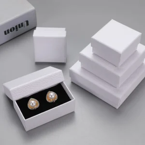
At its most elemental level, a jewelry box consists of a base and a lid. The base is the primary container, the vessel that holds the precious item. Its walls provide structure, its floor a foundation. The lid serves as the protective covering, safeguarding the contents from dust, light, damage. The relationship between the base lid is the first design decision. Does the lid lift off completely, as in a classic two-piece rigid box? Does it pivot on a hinge? Does it slide open like a drawer?
The third core component, often overlooked by novices, is the insert. The insert is the soul of the box's interior. It is the custom-fit cradle, often made of foam, velvet-flocked plastic, or folded paperboard, that secures the jewelry. An insert prevents a delicate necklace from tangling, a pair of earrings from scratching each other, or a ring from rolling loosely. Its design is a direct response to the object it holds, making the packaging a bespoke suit for the jewelry.
Common Styles: Hinged, Two-Piece, and Drawer-Style
The interplay of base lid gives rise to several classic styles. The two-piece box, or lid-off box, is perhaps the most common, seen in everything from board games to luxury iPhones. Its simplicity is its strength. The experience of slowly lifting the lid creates a moment of anticipation.
The hinged box offers a different kind of reveal. The lid remains attached, opening like a treasure chest. The hinge itself can be a simple paper flex-hinge, a cloth ribbon, or an ornate metal component. The choice of hinge dramatically affects the box's character perceived permanence.
The drawer-style box, or slipcase, introduces a sliding motion. The jewelry is revealed as an inner tray is pulled from an outer sleeve. Often, a small ribbon pull is added to facilitate opening. This style creates a sophisticated, multi-stage unboxing sequence that feels both elegant interactive.
The Role of Interior Linings and Fittings
Beyond the structural insert, the interior surfaces offer another layer of creative expression. Lining the inner walls floor with fabric—like satin, velvet, or suede—adds a dimension of softness luxury. A lining does more than provide a gentle surface; it introduces color texture to the interior, often creating a contrast with the exterior. Imagine opening a stark, minimalist white box to reveal a rich, crimson velvet interior. The emotional impact is immediate powerful.
Fittings refer to any additional hardware. These may include tiny magnets for a crisp magnetic closure, metal clasps for a vintage feel, or small feet on the bottom of a wooden box. Each fitting, no matter how small, contributes to the box's functional narrative. They are the punctuation marks in the design's story.
A Practical Guide to DIY Jewelry Box Making
For the artisan, the hobbyist, or the thoughtful gift-giver, creating a jewelry box by hand is a deeply rewarding process. It is an exercise in precision patience. The following sections offer a pathway for those looking to translate ideas into a tangible object, starting with simple materials moving toward more enduring ones.
Material Selection for the Home Crafter
The choice of material is your starting point, it will define the tools you need the techniques you employ. For beginners, non-wood materials are highly accessible.
| Тип материала | Pros | Cons | Лучшее для |
|---|---|---|---|
| Chipboard/Bookboard | Inexpensive, easy to cut and score, lightweight, takes glue well, ideal for wrapping with paper or fabric. | Not as durable as wood, susceptible to moisture, requires precise measurement for clean corners. | Creating custom-sized, paper-wrapped rigid boxes; prototyping designs before committing to wood. |
| Wood (e.g., Pine, Basswood) | Highly durable, offers a classic and premium feel, can be stained or painted, allows for advanced joinery. | Requires specialized tools (saws, sanders), more expensive, steeper learning curve for clean cuts and joints. | Heirloom-quality boxes, traditional designs, projects where natural material beauty is desired. |
| Upcycled Materials (e.g., Tins, old books) | Sustainable and eco-friendly, offers unique character and a built-in narrative, cost-effective. | Limited by the original object's size and shape, may require creative problem-solving to adapt. | Whimsical one-of-a-kind pieces, themed gift boxes, mixed-media art projects. |
For our first project, we will focus on chipboard, as it is the most versatile forgiving material for learning the fundamentals of how to make jewelry boxes.
Essential Tools for Your Workshop
You do not need a vast, expensive workshop to begin. A few key tools, used correctly, will yield professional-looking results.
- Self-Healing Cutting Mat: Protects your work surface allows for safe cutting.
- Metal Ruler with Cork Back: The metal edge provides a guide for your knife that won't be damaged, the cork back prevents slipping.
- Utility Knife or X-Acto Knife: Ensure you have sharp, fresh blades. A dull blade tears paper rather than cutting it, leading to frustration frayed edges.
- Bone Folder: An indispensable tool for creating sharp, crisp creases in paper chipboard. It is also used to smooth out glued surfaces to eliminate air bubbles.
- PVA Glue (like Elmer's Glue-All or specific bookbinding glue): A strong, flexible, acid-free adhesive is necessary.
- Brushes: A few inexpensive brushes for applying glue evenly.
- Clamps or Heavy Books: To hold glued pieces together firmly while they dry.
Step-by-Step: Crafting a Simple Two-Piece Box
Let’s walk through the process of making a simple, elegant two-piece jewelry box using chipboard decorative paper. Think of a fine chocolatier's box; that is the level of precision we are aiming for.
- Determine Your Dimensions: Decide the internal length, width, depth of your box. For a ring, perhaps 2x2x1.5 inches is sufficient.
- Plan the Base: On a piece of chipboard, draw the bottom of your base (2×2 inches). Then, draw the four walls attached to each side. The height of these walls will be the box's depth (1.5 inches). You will have a cross or plus-sign shape.
- Plan the Lid: The lid must fit over the base. Its internal dimensions must be slightly larger than the base's external dimensions. A good rule of thumb is to add about 1/16th of an inch (or 2mm) to the length width. So, the lid's bottom will be 2 1/16 x 2 1/16 inches. The lid's walls are typically shorter; let's make them 0.75 inches deep.
- Cut the Chipboard: Using your sharp knife metal ruler, carefully cut out the cross shapes for both the base lid. Press firmly but safely. It is better to make several shallow passes than one forceful, dangerous one.
- Score the Fold Lines: Where the walls meet the bottom, score the lines. This means cutting only partially through the chipboard. This creates a hinge that allows for a clean, 90-degree fold.
- Assemble the Corners: Fold up the walls. You will need to join the corners. The cleanest method is to use strong paper tape or cloth tape on the inside of the corners to hold them together. Alternatively, a small bead of quick-setting glue can work.
- Select Your Wrapping Paper: Choose a beautiful decorative paper. It could be a simple kraft paper for a rustic look or a luxurious imported art paper.
- Wrap the Base: Cut a piece of your decorative paper that is large enough to cover the entire exterior of the base, with about a 1-inch excess on all sides. Apply an even, thin layer of PVA glue to the paper. Place your assembled base in the center. Smooth the paper up the sides, using the bone folder to eliminate bubbles.
- Finish the Edges: At the top edges, you will need to fold the excess paper over into the inside of the box. Miter the corners (cut a small 45-degree notch) to create a neat fold. Glue the paper down on the inside.
- Wrap the Lid: Repeat the wrapping process for the lid.
- Create an Inner Lining (Optional but Recommended): To hide the folded edges inside, cut a piece of paper or thin cardstock that fits snugly into the bottom of the box. Cut four more strips to line the inner walls. Glue these in place for a perfectly finished interior.
- Dry: Allow the box to dry completely, perhaps under a heavy book to prevent warping.
You have now created a foundational piece. The skills you've just practiced—measuring, cutting, scoring, wrapping—are the building blocks for almost any paper-based box construction.
Secret 1: Material Mastery Beyond the Basic
For brands aiming to create a memorable luxury jewelry box, the conversation moves beyond simple chipboard. The material is not just a structural component; it is the first handshake with your customer. Its weight, texture, even its sound, all communicate a message about the value of what is inside. Understanding advanced materials is the first secret to unlocking a truly premium experience.
The Psychology of Paper: Kraft vs. Art Paper vs. Specialty Textures
The paper you choose to wrap your rigid box in sets the immediate tone.
- Крафт-бумага: Unbleached kraft paper, with its natural brown color visible fibers, speaks of authenticity, sustainability, a rustic or organic ethos. It feels honest unpretentious. Bleached white kraft paper provides a clean, minimalist canvas. You often see подарочные коробки из крафт-бумаги used for eco-conscious or artisanal brands.
- Art Paper (Coated Paper): This is the most common choice for premium packaging. It is a high-quality paper with a clay coating, which creates an incredibly smooth, uniform surface. This surface is ideal for high-resolution color printing. It can have a gloss finish (shiny reflective), a matte finish (dull non-reflective), or a silk/satin finish (a subtle sheen in between). The choice of finish affects how colors appear how the box feels to the touch.
- Specialty & Textured Papers: Here lies a world of sensory delight. Papers can be made with linen, felt, or leather-like textures embossed during their creation. There are papers with pearlescent sheens, soft-touch coatings that feel like velvet, or papers embedded with fibers, flecks of metal, or even flower petals. Running a hand over a textured box creates a tactile memory, a powerful tool in branding (Hultén, 2011).
Understanding Board Thickness and Rigidity
The "rigid" in custom rigid box packaging comes from the dense paperboard that forms its structure, often called greyboard or chipboard. However, in industrial applications, its specifications are precise.
The thickness of the board is measured in millimeters (mm) or points (pt). A typical rigid box might use a board between 1.5mm 3mm thick. A thicker board doesn't just add strength; it adds weight heft. Picking up a heavy, unyielding box triggers a psychological perception of quality value. The decision on thickness is a balance between creating this sense of substance the practicalities of cost shipping weight.
The rigidity itself is a product of how the paper pulp is pressed dried. Denser, high-quality greyboard resists bending warping, ensuring the box maintains its perfect geometric shape from the factory to the customer's hands.
Sustainable Choices: FSC-certified paper, recycled materials, soy-based inks
In 2025, sustainability is not a trend; it is a core expectation for any premium brand. Demonstrating environmental responsibility through your packaging is a powerful statement.
- FSC-Certified Paper: The Forest Stewardship Council (FSC) certification ensures that the paper comes from responsibly managed forests that provide environmental, social, economic benefits. Using FSC-certified paper is a clear, verifiable way to show commitment.
- Recycled Content: Both the wrapping paper the structural greyboard can be sourced with high post-consumer recycled content. This reduces the demand for virgin materials lowers the packaging's carbon footprint.
- Alternative Materials: Innovations are bringing exciting materials to the forefront. These include paper made from agricultural waste (like straw or bamboo), mushroom mycelium, or even algae.
- Soy-Based Inks: Traditional printing inks are petroleum-based, containing volatile organic compounds (VOCs). Soy-based inks are a renewable alternative that are easier to de-ink during the recycling process.
Choosing sustainable materials is not a compromise on luxury. Many sustainable options offer unique textures aesthetics that can become a signature part of a brand's identity.
Secret 2: Structural Integrity as a Brand Statement
How a box is built—its very architecture—is a silent narrator of your brand's story. A flimsy, poorly constructed box suggests a lack of care, which can transfer to the product within. Conversely, a box that is intelligently designed, with satisfying mechanics a solid feel, communicates precision, quality, attention to detail.
The Rigid Box Advantage: Durability and Perceived Value
A custom rigid box, also known as a set-up box, is fundamentally different from a folding carton (like a cereal box). A folding carton is shipped flat is assembled by the end-user. A rigid box is delivered fully formed, its structure robust permanent.
The advantage is twofold. First, the durability is far superior. A rigid box offers exceptional protection for fragile, high-value items like jewelry. Second, as we've touched upon, the perceived value skyrockets. The weight, the sharp 90-degree corners, the inability to collapse it—all these physical cues signal "premium" to the consumer before they even see the product (Spence & Piqueras-Fiszman, 2014). It feels less like disposable packaging more like a permanent storage case, extending its life the brand's presence in the customer's home.
Exploring Advanced Structures: Magnetic Closure, Collapsible Boxes, and Drawer Mechanisms
Beyond the basic two-piece or hinged styles lie a variety of sophisticated structures that can enhance the unboxing experience.
- Magnetic Closure: This is a hallmark of modern luxury packaging. Small, powerful neodymium magnets are embedded within the walls of the box lid. They create a delightful, crisp "snap" upon closing. The sound feel are incredibly satisfying provide a sense of security. The magnets are hidden, so the effect feels like magic.
- Collapsible Rigid Boxes: This is a brilliant innovation that combines the premium feel of a rigid box with the logistical efficiency of a folding carton. These boxes are constructed with pre-scored hinges adhesive panels. They ship flat, dramatically reducing shipping costs warehouse space, can be quickly assembled into a sturdy rigid box by the retailer.
- Drawer Mechanisms with Ribbon Pulls: A single or multi-tiered drawer box (a "chest of drawers" effect) creates a methodical, curated reveal. Each drawer can hold a different component of a jewelry set. The small ribbon pull is a crucial detail. It provides a necessary functional element but also a soft, tactile touchpoint that contrasts with the box's rigidity.
The Engineering of the "Perfect Fit": Tolerances and Precision
The difference between an average box a truly luxurious one often comes down to fractions of a millimeter. This is the world of manufacturing tolerances.
Imagine a two-piece box. If the lid is too tight, it is difficult to open, causing frustration. If it is too loose, it feels cheap may fall off. The "perfect fit" is one where the lid can be lifted with minimal effort, yet there is a subtle vacuum effect or gentle friction that signals a quality seal.
Achieving this requires incredible precision from the manufacturer. The die-cutting tools that cut the greyboard must be perfectly calibrated. The amount of glue used, the thickness of the wrap paper—every variable must be controlled. When working with expert rigid box manufacturers, you are not just buying a box; you are buying their expertise in controlling these minute tolerances across a production run of thousands of units. The same precision applies to the custom inserts, ensuring the jewelry piece fits snugly, without being too difficult to remove.
Secret 3: The Art of the Print Finish
If the material is the canvas the structure is the sculpture, then the print finish is the painterly detail that captures the eye makes the viewer want to reach out touch. These are surface treatments applied after the base colors have been printed. They engage multiple senses add layers of sophistication. This is where a simple custom printed paper box becomes a work of art.
Offset vs. Digital Printing: When to Use Each
First, a word on the foundational printing method.
- Offset Printing: This is the traditional method for high-volume, high-quality printing. It involves creating custom metal plates for each color. The setup costs are high, but the per-unit cost becomes very low on large runs (typically over 1000 units). Offset printing produces exceptionally sharp, consistent color.
- Цифровая печать: This works much like a desktop inkjet or laser printer, applying ink directly to the paper without plates. The setup cost is virtually zero, making it ideal for short runs, prototyping, or projects requiring variable data (e.g., printing a different name on each box). While quality has improved immensely, it can sometimes struggle to match the perfect color consistency of offset printing across a very large run.
For most established brands producing jewelry boxes in volume, offset printing is the standard for the wrapping papers.
Special Finishes that Elevate: Embossing, Debossing, and Foil Stamping
These three techniques are the holy trinity of tactile print finishes.
- Тиснение: This process uses a custom metal die a counter-die to press the paper from underneath, creating a raised, three-dimensional image or text. It literally elevates your logo or a design element from the surface, inviting touch.
- Тиснение: This is the opposite of embossing. The die presses into the surface of the paper from above, creating a depressed imprint. It can feel subtle understated, like a maker's mark pressed into leather.
- Тиснение фольгой: A heated die is used to press a thin film of metallic or pigmented foil onto the paper. It is the only way to achieve a true, reflective metallic finish (gold, silver, copper) or special effects like holographic foils. A foiled logo catches the light communicates opulence instantly.
These techniques can be used in combination. For example, a logo might be both embossed foil-stamped, creating a raised, shimmering effect that is impossible to ignore.
Varnishes and Laminations: Matte, Gloss, and Soft-Touch
These are protective liquid coatings or films applied over the entire printed surface. They protect the ink from scuffing but also have a dramatic aesthetic impact.
| Finish Type | Визуальный эффект | Тактильные ощущения | Общая ассоциация |
|---|---|---|---|
| Gloss Lamination/Varnish | High shine, reflective. Makes colors appear more vibrant and saturated. | Very smooth, slick. | Modern, energetic, eye-catching. |
| Matte Lamination/Varnish | No shine, dull finish. Softens colors and reduces glare. | Smooth but not slick. Can feel more natural. | Understated, elegant, sophisticated, serious. |
| Ламинирование Soft-Touch | Deep matte appearance. | Uniquely soft, velvety, almost rubbery. | Highly luxurious, surprising, premium, tactile. |
| Spot UV Varnish | A high-gloss varnish applied only to specific areas ("spots"). | Creates a contrast between the matte surface and the slick, raised varnish. | Dynamic, highlights specific features, interactive. |
Imagine a deep black box with a matte lamination. Your logo is printed in a slightly darker black but using a Spot UV varnish. In the right light, the logo suddenly appears, gleaming against the non-reflective background. This subtle, sophisticated effect speaks volumes about a brand's confidence. The rise of soft-touch lamination, in particular, has been a game-changer, creating a powerful sensory hook that makes a customer want to hold onto the box.
Secret 4: Designing the Unboxing Experience
In the age of social media, the unboxing of a product is a ritual, a shareable performance. The jewelry box is the stage for this performance. A well-designed unboxing experience builds anticipation, tells a story, makes the customer feel like they are discovering a hidden treasure. It transforms the simple act of opening a package into a memorable event.
The Narrative Arc of Unboxing: Reveal and Presentation
Think of your packaging as a short film with a beginning, a middle, an end.
- The Beginning: The Exterior. This is the first impression. The color, the texture, the weight of the box. Is there a sleeve that needs to be slid off? A ribbon to be untied? These initial interactions are the opening scenes.
- The Middle: The Opening. The act of lifting the lid or sliding the drawer. This is the moment of transition. The sound of the magnetic closure, the smooth slide of the drawer—these are key sensory cues. The interior is revealed. Is there another layer? A sheet of branded tissue paper? A welcome card resting on top? Each layer builds tension excitement.
- – The End: The Reveal. The final layer is removed, the jewelry is presented. How it sits in its insert is the climax of the story. Is it perfectly centered? Angled to catch the light? The goal is to create a "gasp" moment, where the beauty of the product its presentation merge into one powerful impression.
Custom Inserts: Foam, Velvet, Satin, and Paperboard
The insert is the throne upon which your jewelry sits. Its design is not just about protection; it is about presentation.
- Die-Cut Foam (EVA): Ethylene-vinyl acetate (EVA) is a dense, stable foam that provides exceptional protection. It can be precisely die-cut or laser-cut to fit any shape. It is often covered with a thin layer of velvet or suede-like fabric (flocking) to create a soft, luxurious surface. This is the standard for high-end jewelry.
- Velvet-Flocked Thermoformed Plastic: A less expensive alternative to foam, a thin sheet of plastic is heated molded into the desired shape, then coated with flocking. It can achieve complex shapes but may feel less substantial than dense foam.
- Satin-Lined Platforms: A simpler approach involves a raised platform of paperboard wrapped in satin fabric. The jewelry (like a necklace) might be held in place with small slits or loops. This has a classic, soft elegance.
- Custom Paperboard Inserts: For a more eco-friendly approach, inserts can be crafted from folded printed paperboard. This requires clever paper engineering but can create beautiful, fully recyclable interiors. It is a perfect match for brands with a strong sustainability message.
The color of the insert is also a critical choice. A black insert makes diamonds sparkle. A white or cream insert can make colored gemstones pop. The color should complement both the jewelry the overall brand palette.
Incorporating Pull-Tabs, Ribbons, and Other Interactive Elements
Small interactive elements can significantly enhance the unboxing journey.
- Ribbon Pulls: As mentioned, these are essential for drawer-style boxes. The ribbon's width, color, material (grosgrain vs. satin) are all design decisions.
- Lift-Out Tabs: For inserts or platforms, a small ribbon tab can be added to make it easy for the customer to lift the piece out to reveal a compartment below—perhaps for a certificate of authenticity or a care guide.
- Tissue or Vellum Paper: Wrapping the jewelry in a sheet of branded tissue paper or semi-transparent vellum adds a delicate, gift-like layer. The crinkle of the paper is another sensory input.
- Hidden Messages: Printing a small message on the underside of a lid or beneath an insert ("Made for you," "Your journey begins") is a delightful surprise that deepens the customer's emotional connection to the brand.
Every element should feel intentional. The goal is to guide the customer's hands eyes through a carefully choreographed sequence of reveals, making them an active participant in the discovery of their new treasure.
Secret 5: Leveraging Color Theory and Branding
Color is not decoration; it is communication. It is the most immediate visual cue your packaging provides, capable of evoking emotion, suggesting value, triggering brand recognition in an instant. In the world of luxury goods, color is a strategic asset, meticulously chosen managed.
The Emotional Impact of Color in Luxury Packaging
Colors carry deep psychological associations, which can be leveraged in packaging design (Singh, 2006). While cultural interpretations can vary, some general principles hold true in Western markets:
- Black: Associated with power, sophistication, mystery, formality. A matte black box feels modern elegant, while a glossy black box can feel sleek dramatic. It is a dominant color in luxury, providing a stark backdrop that makes precious metals gemstones stand out.
- White: Signifies purity, simplicity, minimalism, cleanliness. It is the color of modern luxury, often used by tech companies beauty brands to convey a sense of effortless elegance.
- Gold/Silver: Directly communicates wealth, opulence, prestige. Used in foil stamping, these colors add an immediate touch of class. Gold feels warm traditional, while silver feels cool contemporary.
- Blue (specifically deep navy or Tiffany Blue): Navy blue conveys trust, stability, authority. The iconic robin's-egg blue of Tiffany & Co., however, is a masterclass in branding. They have so completely owned a specific shade that the box itself is as famous as the jewelry inside.
- Pastels (Pink, Lavender, Mint): Often associated with femininity, romance, gentleness. A soft pink box might be chosen for a line of delicate, romantic jewelry.
- Deep Reds/Burgundies: Evoke passion, love, richness, excitement. A deep red velvet interior is a classic choice for engagement ring boxes.
The choice of color is not about picking a favorite. It is about aligning the emotional message of the color with the identity of your brand the story of the jewelry itself.
Pantone Matching System (PMS) for Brand Consistency
How do you ensure your brand's specific shade of "deep navy" is the exact same color on your jewelry box, your shopping bag, your website? The answer is the Pantone Matching System (PMS).
PMS is a standardized color reproduction system. Each color is given a unique number code (e.g., PMS 1837 C is the code for Tiffany Blue). When you tell a manufacturer to print using a specific Pantone color, they use a pre-mixed ink that precisely matches that standard. This is different from CMYK (Cyan, Magenta, Yellow, Black) printing, where colors are mixed from four base inks during the printing process. While CMYK is great for photos, it can lead to slight color variations from one print run to another.
For a brand's core logo color, using a PMS ink is non-negotiable. It guarantees that your brand's most valuable visual asset is reproduced with perfect consistency, reinforcing brand recognition protecting your identity.
Using Color on the Inside vs. Outside for Surprise and Delight
A powerful technique is to create a contrast between the exterior interior color of the box. This creates a moment of surprise when the box is opened.
- Quiet Exterior, Loud Interior: A minimalist, single-color exterior (e.g., white or grey) can open to reveal a burst of vibrant color inside. This creates a "wow" moment, a secret delight just for the customer. Imagine a simple kraft paper box that opens to a shocking neon pink interior. The contrast is memorable playful.
- Themed Interior: The interior color can be used to support the theme of a jewelry collection. A collection inspired by the sea could have a sandy-colored exterior a deep ocean blue interior.
- Brand Color Reinforcement: The exterior might be a neutral color, while the interior uses the brand's primary signature color. This subtly reinforces the brand identity during the most emotional part of the unboxing—the reveal of the product.
This "reveal" strategy transforms the box from a static object into a dynamic one, with an inner personality that is only discovered upon interaction. It is a simple yet profoundly effective way to make your packaging more engaging.
Secret 6: The Logistical Genius of Smart Packaging
A beautiful, luxurious jewelry box is a triumph of design. But if it is prohibitively expensive to ship, arrives damaged, or takes up too much warehouse space, it becomes a business liability. The sixth secret is understanding that truly great packaging design is a marriage of artistry logistical pragmatism.
Designing for Shipping: Durability vs. Weight
Your jewelry box has two jobs: to look good to protect its contents. The second job is tested most severely during shipping. The package will be dropped, shaken, stacked.
- Structural Reinforcement: The thickness of the greyboard is the first line of defense. For heavier items or for boxes that will travel long distances, choosing a 2.5mm or 3mm board is a wise investment.
- Protective Inserts: A well-designed foam insert does more than present the jewelry; it absorbs shock holds the item securely, preventing it from becoming a projectile inside its own box.
- Outer Shippers: It is rare for a luxury jewelry box to be shipped on its own. It is typically placed inside a larger, plain corrugated cardboard box (an "outer shipper") for transit. The design of the primary jewelry box must account for the dimensions of standard shippers. There should be some buffer space, often filled with tissue paper or other dunnage, to provide an extra layer of cushioning.
The challenge is to achieve a high level of protection without adding excessive weight. Shipping costs are often calculated based on dimensional weight (DIM), which considers the package's size as well as its actual weight. A large but light box can be surprisingly expensive to ship. Efficient design means creating the most compact, protective package possible.
The Rise of Collapsible Rigid Boxes for Reduced Shipping Costs
This innovation is a direct response to the challenge of shipping costs warehousing. Standard rigid boxes are shipped assembled, which means a large portion of what you are shipping is empty space.
A collapsible rigid box is engineered to be stored shipped flat. Imagine a box where the four walls are hinged at the base can be folded down. The corners have pre-applied, high-strength adhesive strips covered by peel-off liners. When the box needs to be used, the walls are pulled up, the liners are removed, the corners are pressed together, creating a strong, permanent rigid box in seconds.
The benefits are enormous:
- Reduced Inbound Shipping Costs: A truck can hold many thousands more flat boxes than assembled ones, dramatically cutting freight costs from the manufacturer.
- Reduced Warehouse Space: The storage footprint is a fraction of that required for assembled boxes, saving valuable warehouse real estate.
- This makes them an excellent choice for businesses with fluctuating demand or limited storage.
Integrating QR Codes or NFC Chips for Digital Experiences
Smart packaging bridges the gap between the physical product the digital world.
- QR Codes: A simple Quick Response code can be subtly printed on the bottom of the box, on an insert card, or on a protective sleeve. Scanning it with a smartphone can lead the customer to a variety of digital experiences: a video showing the craftsmanship behind the jewelry, a detailed care guide, a link to the specific product page for sharing on social media, or an invitation to join a loyalty program.
- NFC Chips: Near Field Communication chips are a more seamless evolution of the QR code. These tiny, paper-thin chips can be embedded invisibly within the packaging. The customer simply taps their smartphone to the box to trigger the digital experience—no camera or app needed.
This "phygital" link extends the brand conversation beyond the initial unboxing. It adds value for the customer provides the brand with a direct channel for communication further engagement. It shows that the brand is forward-thinking technologically savvy.
Secret 7: Partnering with a Manufacturer for Scale and Quality
You can have the most brilliant design in the world, but without a manufacturing partner who can execute it flawlessly, it will remain a dream. For any brand looking to produce more than a handful of boxes, working with a specialist manufacturer is not a luxury; it is a necessity. This final secret is about how to forge a successful partnership.
What to Look for in a Rigid Box Manufacturer
Choosing a partner is a major decision. Look for these key attributes:
- Specialization: Do they specialize in custom rigid box packaging? A general printer may not have the specific equipment or expertise for complex assembly, foil stamping, or creating custom inserts.
- Experience & Portfolio: Look for a company with a long track record a diverse portfolio. Ask to see samples of their work, especially boxes that are similar in style or complexity to your design. A look through a gallery of luxury jewelry box designs can reveal a manufacturer's capabilities.
- Контроль качества: Ask about their quality control process. How do they ensure color consistency? How do they check for assembly defects? A reputable manufacturer will have a rigorous QC protocol at multiple stages of production.
- Communication: Is their team responsive, knowledgeable, fluent in your language? A good partner acts as a consultant, offering suggestions to improve your design or make it more cost-effective to produce.
- Capabilities: Can they handle all the processes you need in-house (e.g., printing, lamination, foil stamping, die-cutting, assembly)? A vertically integrated manufacturer offers more control over quality timeline.
The Prototyping and Sampling Process
Never go straight to mass production. The sampling stage is perhaps the most critical part of the entire process.
- The Dieline: The manufacturer will first create a digital template, or dieline. This is a flat, 2D diagram of your box showing all the cut lines, score lines, glue tabs. You will place your artwork onto this template.
- The White Sample: The manufacturer will produce an unprinted, "white" sample of your box. Its purpose is purely to test the structure. Does it assemble correctly? Is the size right? Is the magnetic closure strong enough? Does the insert fit the product?
- The Printed Sample: Once the structure is approved, the manufacturer will produce a fully printed assembled sample. This is your chance to check the color accuracy, the alignment of the artwork, the quality of the finishes. Hold it, open it, close it. Does it match your vision?
Be meticulous during this stage. A small change is easy to make on a sample; it is a disaster to fix on a run of 10,000 boxes.
From Design File to Mass Production: A Timeline
Understanding the typical production timeline helps in planning your product launch. While it varies, a general timeline might look like this:
- Week 1-2: Consultation & Quoting. You submit your design concept, the manufacturer provides feedback a detailed quotation.
- Week 2-3: Dieline & Artwork. The dieline is created approved, you apply your artwork.
- Week 3-4: Sampling. White printed samples are produced, shipped to you for approval.
- Week 5-8: Mass Production. This is the longest phase. Raw materials are ordered, paper is printed, board is cut, boxes are wrapped assembled.
- Week 9: Quality Control & Packing. Every box is inspected, then packed into master cartons for shipping.
- Week 10-14: Shipping. Depending on whether you choose sea freight (slower, cheaper) or air freight (faster, more expensive), this is the time it takes for the boxes to get from the factory to your warehouse.
Knowing how to make jewelry boxes on a commercial scale is less about your own hands more about your ability to clearly communicate a detailed vision to a skilled manufacturing partner. It is a collaboration, a dance between creative design industrial execution.
Часто задаваемые вопросы (FAQ)
What is the best glue for making paper jewelry boxes at home?
For DIY projects using paper and chipboard, a high-quality PVA (Polyvinyl Acetate) glue is the best choice. Look for formulations specifically sold as "bookbinding glue" or "craft glue" that are acid-free to prevent yellowing over time. They provide a strong, flexible bond dry relatively clear. Apply a thin, even coat to prevent warping the paper.
How much does custom jewelry packaging cost?
The cost of custom rigid box packaging varies dramatically based on several factors: order quantity (higher quantities have a lower per-unit cost), size, complexity of the structure, materials used (specialty papers are more expensive), the number of colors printed, any special finishes (foil stamping, embossing, etc.). A simple, small box in a large run might be under a dollar, while a complex, large box with multiple finishes in a small run could be many dollars per unit. The best way to know is to get a detailed quote from a manufacturer.
What is a sustainable alternative to foam inserts?
Molded pulp or molded fiber inserts are an excellent eco-friendly alternative. Made from recycled paper or other natural fibers (like bamboo or sugarcane), they can be molded into any custom shape to hold jewelry securely. They are biodegradable compostable, aligning perfectly with a sustainable brand ethos. Custom-engineered paperboard inserts are another great, fully recyclable option.
How do I create a dieline for my box design?
While you can sketch a dieline yourself for a DIY project, for professional manufacturing, the manufacturer typically creates the precise dieline for you using specialized software like Adobe Illustrator with CAD plugins. They will base it on your desired dimensions then send you the digital file. Your job as the designer is to correctly place your graphic artwork onto that template.
Каково минимальное количество заказа (MOQ) для жестких коробок, изготовленных на заказ?
MOQs are set by manufacturers to cover their setup costs for printing plates, cutting dies, machine calibration. For custom rigid boxes, the MOQ is often between 500 1,000 units. Some manufacturers may offer lower MOQs, but the per-unit price will be significantly higher because the setup costs are spread across fewer boxes.
Can I use wood for a luxury jewelry box design?
Absolutely. Wood conveys a sense of timeless craftsmanship permanence. Materials like walnut, cherry, or maple, when finely finished, create an unparalleled luxury experience. These are often produced by specialized woodworking shops rather than paper packaging manufacturers. The cost is significantly higher, but for a true heirloom-quality product, a wooden box is the ultimate statement.
How do I ensure my brand's color is printed correctly?
The best way to ensure color consistency is to use the Pantone Matching System (PMS). Provide your manufacturer with the specific PMS code for your brand colors. They will use a pre-mixed ink that exactly matches the Pantone standard, guaranteeing your color looks the same on every box, every time.
Заключение
The journey of understanding how to make jewelry boxes reveals a profound truth: a box is never just a box. At its simplest, it is an act of personal creation, a handmade vessel of affection. At its most complex, it is a sophisticated marketing tool, a physical manifestation of a brand's identity, a carefully engineered experience designed to delight the senses build an emotional connection. From the humble precision of the hobbyist's cutting mat to the industrial might of the die-cutting press, the goal remains the same: to create a home worthy of the treasure it holds. The materials, the structure, the colors, the finishes—these are not disparate elements but a unified language. Learning to speak it allows you to craft a narrative, to protect value, to transform a simple object into a cherished keepsake. Whether you are building one or one hundred thousand, the care invested in the container speaks volumes about the perceived value of what lies within.
Ссылки
Amsberry, D. (2025). APA quick citation guide: In-text citation. Penn State University Libraries. https://guides.libraries.psu.edu/apaquickguide/intext
American Psychological Association. (n.d.-a). In-text citations. APA Style.
American Psychological Association. (n.d.-b). Reference examples. APA Style.
Hultén, B. (2011). Sensory marketing: The multi-sensory brand-experience concept. European Business Review, 23(3), 256–273. https://doi.org/10.1108/09555341111130245
Patton, E. M. (2025). In-text citations – APA Style (7th ed.). Lonestar College.
Purdue Online Writing Lab. (n.d.). In-text citations: The basics. Purdue University. https://owl.purdue.edu/owl/researchandcitation/apastyle/apaformattingandstyleguide/intextcitationsthe_basics.html
Singh, S. (2006). Impact of color on marketing. Management Decision, 44(6), 783–789.
Spence, C., & Piqueras-Fiszman, B. (2014). The perfect meal: The multisensory science of food and dining. Wiley-Blackwell.
University of Toledo. (n.d.). APA style reference citations
AUT Library. (2025). In-text citation – APA 7th referencing style guide. Auckland University of Technology.