
Аннотация
Презентация продукции премиум-класса все больше зависит от структурной целостности и эстетического потенциала жесткой коробочной упаковки. Исследование эффективности закупки и применения такой упаковки показывает, что стратегические ошибки могут привести к значительным финансовым потерям и потерям для бренда. В данном анализе рассматриваются семь распространенных ошибок, с которыми сталкиваются компании при заказе нестандартных решений для жестких коробок в 2025 году. Не ограничиваясь поверхностным обзором, в нем рассматриваются основополагающие принципы материаловедения, структурной инженерии и технологий отделки, которые определяют успешную упаковку. В ходе обсуждения рассматривается связь между физическими характеристиками контейнера и восприятием потребителя, утверждается, что процесс распаковки - это форма повествования. Тщательно изучая актуальные на тот момент экономические, логистические и совместные аспекты производственного процесса, это исследование предлагает основу для принятия обоснованных решений. Цель - вооружить бренд-менеджеров и специалистов по закупкам тонким пониманием, необходимым для превращения упаковки из простого контейнера в мощный инструмент для выражения бренда и создания ценности, избегая распространенных ловушек, которые подрывают качество и увеличивают затраты.
Основные выводы
- Выбирайте материалы не только по стоимости, но и по весу, стоимости и фирменному стилю.
- Согласуйте стиль коробки с предполагаемыми ощущениями при распаковке и функциями продукта.
- Перед началом массового производства протестируйте прототипы в реальных условиях транспортировки и обработки.
- Выбирайте партнера-производителя, ориентируясь на опыт, качество и коммуникабельность.
- Поймите, как печать и отделка влияют как на восприятие бренда, так и на бюджет вашей упаковки в жесткие коробки.
- Разработайте индивидуальные вкладыши, чтобы обеспечить безопасность продукции и сделать ее более презентабельной.
- Точный расчет общей стоимости, включая доставку, тарифы и хранение.
Оглавление
- Основополагающая роль материаловедения
- Поверхностный подход к структурному дизайну и стилю
- Пренебрежение нюансами техники печати и отделки
- Недооценивая важность индивидуальных вставок и безопасности продукции
- Просчеты в экономике производства и перевозок
- Отсутствие прототипирования и тщательного тестирования
- Выбор партнера по производству только по цене
- Часто задаваемые вопросы
- Заключение
- Ссылки
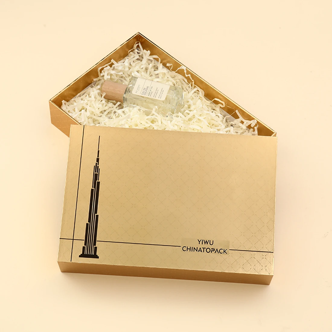
Разговор между брендом и его клиентом начинается задолго до использования продукта. Он начинается со взгляда, прикосновения, момента предвкушения. В этом безмолвном диалоге упаковка - первое произнесенное слово. Для товаров премиум-класса, от деликатной косметики до сложной электроники, это первое слово часто произносят жесткие коробки. Это не просто тара, это заявление о ценности, обещание качества и физическое воплощение индивидуальности бренда. Хорошо выполненная жесткая коробка не просто защищает содержимое, она возвышает его, превращая акт вскрытия покупки в запоминающееся событие, в ритуал.
Однако путь к созданию таких впечатлений сопряжен со сложностями, которые часто недооцениваются. Подбор материалов, выбор формы конструкции, применение отделки - это не просто технические характеристики. Это решения, которые имеют глубокие последствия для восприятия бренда, его операционного бюджета и связи с потребителем. Подходить к этому процессу без глубокого, почти философского, понимания его составляющих - значит допускать ошибки. Последствия таких ошибок не тривиальны: они проявляются в виде превышения бюджета, испорченного товара, размытого послания бренда и, что самое печальное, разочарованного потребителя. Данное исследование задумано как руководство для навигации по этой сложной местности. Это попытка осветить семь наиболее распространенных и дорогостоящих ошибок, которые совершают компании в 2025 году при заказе жестких коробок на заказ, и предложить более взвешенный, сочувственный и в конечном итоге успешный подход. Для начала давайте рассмотрим саму субстанцию, из которой изготавливаются эти объекты выражения бренда.
Основополагающая роль материаловедения
Заказывать жесткую коробку без предварительного изучения состава ее материала - все равно что архитектору проектировать небоскреб, не имея представления о стали и бетоне. Материал - это не случайная деталь; это фундамент, на котором строятся все остальные атрибуты - долговечность, эстетика и тактильные ощущения. Распространенная и дорогостоящая ошибка - рассматривать выбор материала через узкую призму первоначальной стоимости, игнорируя более глубокую историю, которую материалы рассказывают о ценностях бренда и его приверженности качеству.
Суть дела: Выбор подходящего чипборда
В основе любой упаковки из жестких коробок лежит подложка, обычно это тип картона, известный как ДСП или серый картон. Считайте, что это скелет коробки. Его основная задача - обеспечить структуру, жесткость и защиту. Неправильный выбор толщины и плотности этого основного материала - частый источник неудач при упаковке. Слишком тонкий картон для тяжелых предметов, таких как стеклянная свеча или флакон духов, будет казаться хлипким и ненадежным, создавая впечатление дешевизны и подрывая воспринимаемую ценность продукта внутри. И наоборот, излишне толстый картон для легкого изделия, например шелкового платка, может показаться неуклюжим и расточительным, представляя собой неправильное распределение ресурсов.
Как определить подходящую подложку? Процесс принятия решения должен быть обдуманным расчетом, включающим три переменные: вес продукта, его стоимость и желаемая воспринимаемая тяжесть. Для тяжелого дорогостоящего электронного устройства плотная ДСП высокого качества (возможно, толщиной 2-3 мм) не подлежит обсуждению. Она обеспечивает необходимую защиту при транспортировке и создает у потребителя ощущение надежности и солидности. Для деликатных ювелирных украшений можно использовать чуть более тонкий, но все еще плотный картон, сосредоточившись на создании утонченного, похожего на шкатулку для драгоценностей ощущения, а не на массивности. Необходимо задаться вопросом не только "Что защитит изделие?", но и "Какое физическое присутствие подтвердит его ценность?". Выбор ДСП - это первый и наиболее фундаментальный ответ на этот вопрос. Бренд, который понимает это, может начать создавать упаковку, которая будет целостной с самого начала.
Внешняя одежда: Глубокое погружение в материалы для обертывания
Если ДСП - это скелет, то оберточный материал - это кожа и одежда. Это самый заметный и тактильный элемент коробки, отвечающий за визуальную идентичность бренда и создающий первичное сенсорное впечатление. Выбор материала огромен, и поверхностный выбор может мгновенно удешевить хорошо сконструированную коробку. Обычно выбирают художественную бумагу, крафт-бумагу, текстурированную бумагу и даже текстиль, например лен или бархат.
Художественная бумага, часто мелованная для придания гладкости, представляет собой превосходный холст для высококачественной печати. Она позволяет создавать четкую графику, яркие цвета и фотографические изображения, что делает ее подходящей для брендов, которые полагаются на сильное визуальное повествование, как, например, в мире косметические коробки. Однако его гладкость иногда может казаться банальной, если не дополнить ее другими видами отделки.
Крафт-бумага, имеющая натуральный, волокнистый вид, передает различные ценности. Она может вызывать ассоциации с землей, подлинностью и приверженностью к устойчивому развитию. Для бренда органических средств по уходу за кожей или производителя ремесленных товаров красиво напечатанная подарочная коробка из крафт-бумаги может гораздо больше соответствовать его этике, чем глянцевая мелованная бумага. Сама текстура становится частью послания.
Помимо этого, мир специальной бумаги предлагает уникальные тактильные ощущения. Представьте себе коробку для роскошных часов, обернутую в бумагу с тонкой текстурой, напоминающей кожу, или коробку для свадебного альбома, обернутую в перламутровую, мерцающую бумагу. Такой выбор превращает коробку из простого контейнера в объект чувств. Решение должно напрямую вытекать из основной идентичности бренда. Бренд современный и минималистичный? Лучше всего подойдет матовая однотонная упаковка. Он роскошный и традиционный? В этом случае уместнее будет обертывание с текстурой, возможно, из ткани. Игнорировать это - значит упустить главную возможность невербальной коммуникации.
Невидимые узы: клеи и структурная целостность
Менее эффектным, но принципиально важным компонентом упаковки жестких коробок является клей, используемый для ламинирования обертки на ДСП и для скрепления конструкции коробки. В мире сжатых сроков и давления на стоимость некоторые производители могут выбрать клей более низкого качества. Непосредственные последствия такого выбора могут быть неочевидны, но скрытые риски весьма значительны.
Некачественный клей может выйти из строя в условиях повышенной влажности или перепадов температуры, что приведет к пузырению, отслаиванию или отслоению упаковки от ДСП. Представьте себе, что покупатель получает продукт премиум-класса, а упаковка буквально разваливается по швам. Ущерб для восприятия бренда будет мгновенным и серьезным. Клей, хотя и невидимый, является гарантом долговечности коробки и ее способности выдержать суровые условия цепочки поставок и испытание временем на полке потребителя.
Ответственный партнер-производитель будет использовать высококачественные клеи, часто на животной основе или специализированные синтетические полимеры, выбранные за их прочное сцепление и устойчивость к воздействию факторов окружающей среды. При обсуждении проекта не будет лишним поинтересоваться типом используемых клеев. Этот вопрос свидетельствует о внимании к деталям и стремлении к качеству, которое распространяется на все компоненты упаковки. Это небольшой вопрос, который многое говорит об основательности бренда.
Вопрос устойчивого развития: Выбор материала и этика бренда
В 2025 году позиция бренда в отношении экологической ответственности не является второстепенным вопросом; в сознании многих потребителей она занимает центральное место в его идентичности и лицензии на деятельность. Выбор материала для упаковки жестких коробок - важный этап, на котором проявляется эта ответственность. Выбор материалов без учета их воздействия на окружающую среду - это ошибка, которая может привести к критике со стороны общественности и отторжению растущего сегмента рынка.
Сердцевина ДСП может быть получена из переработанного сырья, и указание высокого процента содержания отходов после потребления (PCW) является мощным заявлением. Многие высококачественные, структурно прочные плиты выпускаются с содержанием вторичного сырья 80-100%. Оберточный материал предлагает аналогичные возможности. Бумага, сертифицированная Лесным попечительским советом (FSC), гарантирует, что целлюлоза получена из ответственно управляемых лесов. Альтернативные волокна, такие как бамбук, хлопок или конопля, также могут быть использованы в качестве оберточного материала, обеспечивая как уникальную текстуру, так и убедительную историю устойчивого развития.
Даже краски и клеи могут быть подвергнуты тщательному анализу. Чернила на соевой основе - более экологичная альтернатива традиционным чернилам на нефтяной основе. Клеи на водной основе могут быть предпочтительнее вариантов на основе растворителей. Задача состоит в том, чтобы собрать коллекцию материалов, которая не только отвечает эстетическим и структурным требованиям проекта, но и формирует последовательное и аутентичное повествование об охране окружающей среды. Бренд, который успешно справляется с этой сложной задачей, демонстрирует корпоративную эмпатию - осознание своего влияния на мир, что находит глубокий отклик у современного потребителя.
Поверхностный подход к структурному дизайну и стилю
Физическая форма жесткой коробки - это основной способ взаимодействия с пользователем. Структура диктует, как держать коробку, как ее открывать и как представлять находящийся в ней продукт. Рассматривать выбор стиля как вопрос предпочтений, оторванный от функции и повествования о распаковке, - глубокая ошибка. Структура - это грамматика языка упаковки; неудачно выбранная структура может сделать сообщение бессвязным, какими бы красивыми ни были материалы.
За пределами прямоугольника: Изучение таксономии стилей жестких коробок
Вселенная жестких коробок выходит далеко за рамки простой конфигурации крышки и основания. Каждый конструктивный стиль предлагает уникальную последовательность раскрытия и различный набор функциональных преимуществ. Если не изучить эту таксономию, можно упустить возможность создать по-настоящему отличительный и запоминающийся момент бренда. Давайте рассмотрим несколько основных стилей.
Сайт Коробка для телескопаКлассический и, пожалуй, самый узнаваемый стиль, который часто называют "крышкой без крышки" или "двухкомпонентной" коробкой. Она состоит из отдельной крышки, которая помещается на основание. Магия этого стиля заключается в "раскрытии". Трение и скорость снятия крышки могут быть точно рассчитаны. Медленное, мягкое отделение создает предвкушение, идеально подходящее для роскошная шкатулка для украшений. Более свободный крой обеспечивает быстрый и легкий доступ. Вариаций множество: от крышек с полным телескопом, закрывающих все основание, до крышек с частичным телескопом, создающих визуально интересную полосу цвета или текстуры.
Сайт Коробка с магнитной крышкойКоробка в стиле "книга" - это совсем другое удовольствие. Здесь крышка крепится к основанию на шарнирах и фиксируется встроенными магнитами. Щелчок" магнитов при закрытии коробки обеспечивает мощную слуховую и тактильную обратную связь, передавая точность и качество. Этот стиль меньше похож на контейнер и больше на постоянный футляр, что способствует многократному использованию. Он особенно хорошо подходит для технических гаджетов, корпоративных наборов и элитных спиртных напитков, где сама упаковка является частью ценностного предложения продукта. Хорошо продуманный дизайн жесткая коробка с магнитной застежкой может стать ценным сувениром.
Сайт Ящик с выдвижными ящикамиКоробка-слайдер, или "слайдер", вносит элемент открытия. Продукт раскрывается, когда внутренний лоток выдвигается из внешнего рукава. Этим скользящим движением можно управлять с помощью ленточных тяг или выемок для большого пальца. Это игривый, интерактивный стиль, который прекрасно подходит для косметических наборов, кондитерских изделий и небольших предметов одежды. Двухкомпонентная структура также предлагает интересные возможности для контраста цветов и текстур между рукавом и ящиком.
Чтобы прояснить эти различия, полезным инструментом может стать сравнительная таблица.
| Стиль | Ключевая особенность | Опыт распаковки | Общее использование | Относительная стоимость |
|---|---|---|---|---|
| Телескоп (крышка и основание) | Отдельная крышка устанавливается на основание | Классическое, контролируемое раскрытие | Одежда, настольные игры, обувь | Умеренный |
| Магнитное закрытие | Откидная крышка с магнитным уплотнением | Удовлетворяющий щелчок, ощущение высокого класса | Электроника, предметы роскоши, наборы | Высокий |
| Выдвижной ящик (слайдер) | Лоток выдвигается из втулки | Интерактивные, ориентированные на открытия | Косметика, кондитерские изделия, мелкие подарки | Высокий |
| Складной/разборный | Поставляется в плоском виде, собирается пользователем | Экономия места, эффективность | Электронная коммерция, сезонные подарки | Умеренно-высокий |
| Плечо и шея | Внутренняя "горловина" разделяет крышку и основание | Создает цветовое раскрытие, премиум | Парфюмерия, часы, духи | Очень высокий |
Ритуал распаковки: как структура диктует впечатления
Термин "опыт распаковки" стал привычным, однако принципы, на которых он основывается, зачастую плохо понятны. Структура жесткой коробки является основным автором этого опыта. Выбор структуры должен быть продуманным хореографическим актом, призванным провести пользователя через ряд моментов.
Продумайте эмоциональную дугу. Хочет ли бренд создать ощущение напряженности и предвкушения? Этого можно добиться с помощью телескопического ящика с плотной посадкой или ящика с медленно выдвигающимися ящиками. Хочет ли бренд передать ощущение немедленного и приятного доступа? Магнитный ящик, который открывается чисто и полностью представляет продукт, будет более эффективным. Физические действия, которые должен совершить пользователь - поднять, потянуть, открыть крышку, - являются частью опыта. Неуклюжая, запутанная или трудно открывающаяся коробка вызывает разочарование, сводя на нет положительные эмоции, которые бренд надеется вызвать.
Ориентация изделия также диктуется конструкцией. Неглубокое основание в ящике-телескопе может представить изделие, как мемориальную доску в рамке. В ящике с выдвижными ящиками можно показать ряд предметов в последовательности. Магнитная коробка может открываться как книга, рассказывая историю, а напечатанный текст на внутренней крышке дополняет товар справа. Конструкция - это не просто коробка, это сцена. Не продумав, как будет "поставлен" продукт, вы игнорируете театральный потенциал упаковки.
Функциональная элегантность: Дизайн красоты и практичности
Красивая коробка, не выполняющая своей главной обязанности по защите продукта или непрактичная для цепочки поставок, - это провал дизайна. Стремление к эстетической новизне не может быть оторвано от требований реальности. Распространенной ошибкой является проектирование сложной, визуально ошеломляющей конструкции без учета ее последствий для сборки, транспортировки и хранения.
Складные или нескладные жесткие коробки представляют собой блестящий синтез элегантности и практичности. Эти коробки сконструированы таким образом, что их можно перевозить и хранить в плоском виде, что значительно снижает транспортные расходы и потребность в складских помещениях. Затем они могут быть быстро собраны в окончательную жесткую форму либо самим брендом, либо, в некоторых случаях, конечным потребителем. Хотя первоначальная стоимость единицы продукции может быть несколько выше из-за более сложной конструкции, экономия на логистике может быть огромной, особенно при больших объемах заказов или международных перевозках.
Еще один функциональный момент - возможность многократного использования. Хорошо сделанная жесткая коробка, особенно на магнитах или с заплечиками, имеет высокую воспринимаемую ценность и вряд ли будет выброшена. Бренды могут поощрять это, разрабатывая коробку как полезный контейнер для хранения продукта или других предметов. Это продлевает срок службы упаковки, сохраняя название и логотип бренда в доме или офисе покупателя еще долго после первой покупки. Это превращает упаковку из одноразового расходного материала в долгосрочный маркетинговый актив. Проектирование для этой вторичной цели требует предусмотрительности, учета размеров и долговечности, которые выходят за рамки момента первоначальной распаковки.
Пренебрежение нюансами техники печати и отделки
Поверхность жесткой коробки - это холст. Выбор цвета, текстуры и графических элементов, нанесенных на этот холст, может либо возвысить дизайн до произведения искусства, либо свести его к обычному товару. Многие компании, торопясь с производством или стремясь сократить расходы, принимают поверхностные решения о печати и отделке. Они не понимают, что эти техники - не просто украшение; это сложный словарь, способный передавать сложные сообщения бренда и вызывать особые эмоциональные реакции. Тонкое понимание этой лексики просто необходимо.
Язык цвета: офсетная печать против цифровой и соответствие Pantone
Первый и самый мощный визуальный сигнал, который подает упаковка, - это цвет. Метод нанесения этого цвета является основополагающим решением. Два основных промышленных метода - офсетная и цифровая печать.
Офсетная печать предполагает создание специальных пластин для переноса чернил на оберточный материал. Его основными преимуществами являются точность цветопередачи, стабильность при больших тиражах и более низкая стоимость единицы продукции при больших объемах. Это золотой стандарт для достижения точного соответствия цветов по системе Pantone Matching System (PMS). Для такого бренда, как Tiffany & Co., чей особый оттенок синего цвета неотделим от его идентичности, точность офсетной печати не подлежит обсуждению. Однако затраты на изготовление печатных форм делают ее нерентабельной для небольших тиражей.
Цифровая печать Наносит чернила непосредственно на бумагу, подобно настольному струйному принтеру, но в промышленных масштабах. Его главное преимущество - гибкость. Он не требует пластин, что делает его экономически эффективным для коротких тиражей, прототипов и дизайнов, требующих персонализации или переменных данных. Хотя современные цифровые печатные машины добились огромных успехов в области качества, добиться идеального совпадения Pantone иногда бывает сложнее, чем при офсетной печати.
Ошибка заключается не в том, чтобы предпочесть одно другому, а в том, что вы выбираете, не понимая компромиссов. Стартап, выпускающий ограниченный тираж продукции, может найти гибкость цифровой печати идеальной. Глобальный косметический бренд, выпускающий сотни тысяч единиц продукции, выиграет от последовательности и экономичности офсетной печати. Выбор должен быть стратегическим, балансирующим между объемом, бюджетом и строгими требованиями к сочетаемости цветов.
| Характеристика | Офсетная печать | Цифровая печать |
|---|---|---|
| Лучший для объема | Высокий (1000+ единиц) | От низкого до среднего |
| Стоимость установки | Высокая (за счет пластин) | От низкого до нулевого |
| Стоимость единицы продукции | Уменьшается с увеличением объема | Относительно статичный |
| Точность цветопередачи | Превосходно, идеально подходит для Pantone | Очень хорошо, но соответствие может быть разным |
| Время выполнения заказа | Длиннее | Быстрее |
| Переменные данные | Невозможно | Идеально подходит для персонализации |
Тактильный диалог: Тиснение, дебоссинг и тиснение фольгой
Помимо цвета, поверхность коробки может задействовать чувство осязания. Техники отделки превращают плоскую, визуальную поверхность в трехмерную, тактильную.
Тиснение и тиснение это процесс, при котором с помощью штампа на бумаге создается рельефный (тиснение) или углубленный (дебоссирование) оттиск. Логотип, название бренда или узор могут получить физическое присутствие, приглашающее прикоснуться к ним. Проведение кончиком пальца по тисненому гербу на коробке для тонкой ручки, например, создает мультисенсорное подтверждение качества. Слепое тиснение (без чернил или фольги) - это особенно тонкий и изысканный эффект, передающий уверенность и сдержанную роскошь.
Тиснение фольгой Нанесение тонкого слоя металлической или пигментированной фольги на поверхность с помощью тепла и давления. Это классический признак роскоши. Традиционными вариантами являются золотая, серебряная и медная фольга, но существует огромный спектр цветов, включая голографическую и матовую фольгу. Фольгу можно использовать для выделения логотипа, создания декоративной рамки или придания блеска минималистичному дизайну. Ошибка часто заключается в чрезмерном использовании. Небольшой, со вкусом нанесенный акцент из фольги может выглядеть гораздо более эффектно, чем поверхность, покрытая чрезмерным блеском. Искусство заключается в сдержанности.
Слои восприятия: Лаки, ламинации и покрытия
Последний защитный и эстетический слой, наносимый на печатную пленку, - это покрытие. Этот выбор существенно влияет на конечный внешний вид и ощущение от коробки, а также на ее долговечность.
Ламинирование На бумагу наносится тонкая пластиковая пленка. A глянцевое ламинирование создает блестящую, отражающую поверхность, которая делает цвета яркими. Она долговечна, ее можно протирать, и она говорит о живости и энергии. A матовое ламинирование создает неотражающую, изысканную отделку, гладкую и почти мягкую на ощупь. Оно часто воспринимается как более элегантное и современное. Более новый вариант, ламинирование soft-touchВ данном случае речь идет о бархатистой или похожей на замшу текстуре, к которой почти невозможно прикоснуться. Это добавляет значительный уровень воспринимаемой ценности.
Лаки это жидкие покрытия, которые могут наноситься на весь лист ("заливной" лак) или на отдельные участки ("точечный" лак). Точечный глянцевый лак, нанесенный поверх матовой ламинации, - популярная техника. С его помощью можно сделать фотографию или логотип "ярким" благодаря глянцевому покрытию, в то время как фон остается матовым, создавая тонкий, но эффектный контраст текстуры и отражающей способности.
Ошибка заключается в том, что вы не учитываете взаимосвязь между этими видами отделки и индивидуальностью бренда. Бренд, стремящийся к смелому, энергичному присутствию, может выбрать глянцевую ламинацию. Бренду, культивирующему ауру спокойной роскоши, больше подойдет мягкая на ощупь матовая ламинация. Бренд, который хочет направлять взгляд пользователя, может использовать точечный лак для создания иерархии визуальной информации на поверхности коробки. Это не просто защитные покрытия - это инструменты для формирования восприятия.
Цена сложности: Баланс между стремлением и бюджетом
Каждый процесс отделки - каждый слой фольги, каждый проход тиснильного аппарата, каждое точечное нанесение лака - добавляет один шаг к производственному процессу. И каждый шаг увеличивает стоимость. Распространенная и душераздирающая ошибка - разработать "коробку мечты" с множеством сложных видов отделки, а потом обнаружить, что стоимость каждой единицы продукции непомерно высока.
Сочувствующий и опытный партнер-производитель может стать бесценным помощником в этой области. Они могут помочь бренду добиться желаемого эффекта более экономичным способом. Например, возможно, использовать чернила цвета "металлик", чтобы приблизить внешний вид фольги при меньших затратах. Возможно, текстурированная бумага может обеспечить тактильные ощущения от тиснения без необходимости отдельного процесса. Диалог должен быть не "Можно ли это сделать?", а скорее "Вот ощущение, которое мы хотим создать. Какой наиболее разумный и эффективный способ достичь этого ощущения в рамках нашего бюджета?". Такой совместный подход, уравновешивающий творческие устремления и производственную реальность, является ключом к тому, чтобы избежать разочарования от невоспроизводимого дизайна.
Недооценивая важность индивидуальных вставок и безопасности продукции
Внешняя красота жесткой коробки создает обещание, а внутренняя - выполняет его. Частая и пагубная ошибка - сосредоточить все дизайнерские и бюджетные ресурсы на внешней стороне коробки, а внутрь поместить продукт с минимальной продуманностью, окружив его типовым наполнителем или, что еще хуже, оставив его ненадежно болтаться. Вкладыш - это не второстепенная деталь. Это сцена, на которой дебютирует продукт, и она является главным гарантом его сохранности. Пренебречь вставкой - значит спроектировать прекрасный театр без сидений и с протекающей крышей.
Идеальная посадка: Философия индивидуальных вставок
Задача индивидуального вкладыша двояка: презентация и защита. Хорошо продуманный вкладыш плотно и надежно фиксирует продукт, предотвращая его перемещение во время транспортировки, которое может привести к потертостям, царапинам или поломке. Такая защита обеспечивает спокойствие как бренду, так и покупателю.
Помимо простой защиты, вкладыш играет важную роль в искусстве презентации. Он обрамляет изделие, повышая его статус от простого предмета до ценного владения. Представьте себе, что вы открываете коробку и обнаруживаете в ней часы, которые лежат под небольшим углом, идеально отцентрированные в углублении с бархатной подкладкой, а рядом находится небольшое углубление для гарантийного талона. Это не просто хранение, это кураторство. Вставка управляет раскрытием. Он может спрятать аксессуары под фальшполом, чтобы обнаружить их позже, или представить многокомпонентный продукт в логичной, интуитивно понятной компоновке.
К дизайну вкладыша следует подходить с той же тщательностью, что и к дизайну самой коробки. Он требует точных измерений продукта, учета того, как пользователь будет извлекать товар (есть ли выемки для пальцев или ленты для помощи?), а также видения идеального угла презентации и расположения. Использование универсального решения, подходящего по размеру, означает, что сам продукт является универсальным и взаимозаменяемым. Индивидуальный подход говорит о заботе, точности и уверенности в том, что продукт достоин своего индивидуального окружения.
Материальность интерьера: Пенопласт, картон и формованная целлюлоза
Выбор материала для вставки так же важен, как и выбор материала для коробки. Каждый вариант предлагает свой баланс защиты, эстетики и стоимости.
Пенопластовые вставкиКак правило, полиэтиленовые (PE) или полиуретановые (PU), обеспечивают превосходный уровень амортизации и защиты. Они могут быть вырезаны с предельной точностью для создания полостей, точно соответствующих форме изделия. Это делает пену идеальным выбором для хрупких и дорогостоящих предметов, таких как электроника, стекло или чувствительные инструменты. Пенопласт может быть обшит тканью (например, бархатом или атласом), чтобы усилить ощущение роскоши, создавая мягкое, защитное гнездо для изделия. Однако традиционные пенопласты изготавливаются на основе пластика, что может быть существенным недостатком для брендов, ориентированных на экологичность.
Вставки из картона изготавливаются из тех же материалов - кардстока или ДСП, которые используются для изготовления других видов упаковки. Их можно складывать и высекать для создания сложных платформ, перегородок и держателей. Вкладыши из картона легко настраиваются и на них можно наносить печать, что позволяет продолжать брендирование и размещать внутри коробки обучающий текст. Кроме того, они легче поддаются переработке, чем пенопласт, что делает их более экологичным выбором. Хотя они не могут обеспечить такой же уровень амортизации при ударах, как пенопласт, для многих продуктов их защиты вполне достаточно. Они создают чистый, структурный и часто экологически безопасный эстетический вид.
Вставки из формованной целлюлозы становятся все более популярным и экологичным вариантом. Изготовленная из переработанной бумаги и воды, формованная целлюлоза может быть сформирована в индивидуальные формы, похожие на яичную коробку. Она обеспечивает отличную прочность и амортизацию, а также имеет ярко выраженный органический, экологичный вид и ощущение. Для брендов, которые хотят совместить надежную защиту с мощным посланием об устойчивом развитии, формованная целлюлоза - отличный выбор. Она демонстрирует заботу об окружающей среде, которая является подлинной и глубоко интегрирована в дизайн упаковки.
От мастерской до порога: Проектирование для транзита и демонстрации
У жесткой коробки две жизни: путешествие по цепочке поставок и жизнь с покупателем. Вкладыш должен быть спроектирован так, чтобы служить и там, и там. Во время транспортировки основной задачей является обездвиживание и амортизация. Вкладыш должен предотвращать перемещение продукта в любом направлении и поглощать удары, вибрации и падения, которые являются неизбежной частью транспортировки.
Частой ошибкой является разработка вставки, которая выглядит красиво, но конструктивно слаба. Испытания на падение и вибрацию - это не дополнительная роскошь, а необходимая часть процесса проектирования. Прототип коробки и вкладыша, содержащий реальный продукт или эквивалент по весу и форме, должен быть отправлен через курьерскую сеть и возвращен, либо подвергнут имитационным транзитным испытаниям в лаборатории. Только в этом случае бренд может быть уверен, что его упаковка выполнит свою защитную функцию.
Дизайн вкладыша также должен учитывать условия розничной торговли или конечного потребителя. Если продукт будет выставляться в магазине, позволяет ли вкладыш привлекательно представить его в открытой коробке? Легко ли конечному пользователю извлечь продукт, не повредив его или вставку? Предусмотрено ли интуитивно понятное место для аксессуаров, кабелей и руководств? Учет этих вопросов превращает вкладыш из простого куска ткани в неотъемлемую часть философии дизайна, ориентированной на пользователя.
Просчеты в экономике производства и перевозок
Красиво спроектированная и идеально сконструированная жесткая коробка будет успешной только в том случае, если она коммерчески жизнеспособна. Удивительно распространенной и губительной ошибкой является разработка концепции упаковки в творческом вакууме, без тщательного и целостного понимания экономических реалий производства, транспортировки и хранения. Цена за единицу продукции, указанная производителем, - это лишь одна часть гораздо более сложной финансовой головоломки. Игнорировать другие части - значит рисковать тем, что проект окажется либо убыточным, либо гораздо более дорогим, чем предполагалось.
Экономия от масштаба: Количество заказов и стоимость единицы продукции
Производство жестких коробок, особенно с использованием офсетной печати и нестандартных штампов для резки или отделки, связано со значительными затратами на установку. Это постоянные расходы, которые необходимо оплатить независимо от того, будет ли заказ на 500 или 50 000 коробок. Сюда входит стоимость печатных форм, вырубных штампов и время, необходимое для калибровки оборудования для конкретной работы.
Прямым следствием этого является принцип, известный как экономия на масштабе. При увеличении количества заказа фиксированные затраты на установку распределяются на большее количество единиц продукции, что приводит к снижению стоимости единицы продукции, зачастую значительному. Ошибка новичков заключается в том, что они запрашивают предложение на небольшую партию (например, 500 единиц) и бывают шокированы высокой ценой за единицу продукции. Дело не в том, что производитель дорогой, а в том, что затраты на наладку амортизируются на очень маленькой партии.
Стратегический подход предполагает откровенный разговор с партнером-производителем о ценовых уровнях. Следует запросить котировки на несколько уровней количества (например, 1 000, 2 500, 5 000 и 10 000 единиц). Эта информация позволит бренду принять взвешенное решение, сопоставив более низкую стоимость единицы продукции при более крупном заказе с последствиями для денежного потока и расходами на хранение большего количества запасов. Может оказаться, что заказ 2 500 единиц, даже если он покроет потребности на целый год, в долгосрочной перспективе будет гораздо экономичнее, чем размещение двух отдельных заказов по 1 250 единиц.
Скрытые измерения: Доставка, тарифы и складское хранение
Стоимость жесткой коробки не заканчивается, когда она покидает завод. Окончательная "стоимость на месте" включает в себя ряд других факторов, которые часто недооцениваются.
Стоимость доставки являются важным фактором, особенно при производстве за рубежом. Жесткие коробки, будучи трехмерными и нераскладывающимися (если только они не предназначены специально для этого), занимают значительное пространство. Стоимость их доставки рассчитывается на основе "объемного веса", который является мерой плотности. Большая и легкая коробка может стоить дороже, чем маленькая и тяжелая. Бренды должны сотрудничать со своим производителем, чтобы получить точные расчеты для доставки полной партии продукции. Выбор разборной жесткой конструкции коробки может дать огромную экономию в этой области, поскольку позволяет упаковать гораздо большее количество единиц продукции в один транспортный контейнер.
Тарифы и пошлины это налоги, которыми страна облагает импортируемые товары. Они сильно различаются в зависимости от страны происхождения, страны назначения и конкретной классификации товара. В 2025 году эта политика может быть изменчивой и подверженной изменениям. Было бы грубой ошибкой считать, что эти расходы незначительны. Бренд должен сотрудничать с таможенным брокером или логистическим партнером, чтобы получить точный расчет тарифов и пошлин, которые будут применяться к его грузу. Если не учесть в бюджете тарифы 10%, 15% или даже 25%, проект может стать нерентабельным.
Расходы на складирование и хранение еще одна скрытая статья расходов. Большой заказ жестких коробок, приобретенных по более низкой цене за штуку, необходимо где-то хранить. Для этого требуется складское помещение, что связано с определенными расходами. Коробки должны храниться в климатической среде, чтобы предотвратить их повреждение от влажности или перепадов температуры. Эти расходы на хранение должны быть учтены в общей стоимости упаковки за весь срок ее службы.
Ценность времени: Сроки изготовления и планирование проектов
Последняя экономическая переменная - время. Упаковка в жесткие коробки - это не готовый продукт. Она изготавливается на заказ и требует многоступенчатого производственного процесса. Этот процесс требует времени. Типичный срок выполнения заказа, от окончательного утверждения проекта до готовности к отправке, может составлять от нескольких недель до нескольких месяцев, в зависимости от сложности коробки и графика производства производителя.
Критической ошибкой является обращение к производителю с нереальными сроками. Это создает ситуацию, когда единственный способ уложиться в срок - заплатить непомерную плату за срочную доставку, пойти на компромисс с качеством или отправить готовую продукцию дорогим воздушным транспортом вместо более экономичного морского. Авиаперевозки могут быть в десять-пятнадцать раз дороже морских, и эти расходы могут в одиночку разрушить бюджет проекта.
Правильный план проекта должен быть разработан в обратной последовательности от даты запуска продукта. Он должен учитывать разработку и доработку (2-4 недели), создание прототипа и тестирование (2-3 недели), массовое производство (4-8 недель) и доставку (4-6 недель для морских перевозок). Заложить несколько дополнительных недель - разумная мера, чтобы учесть возможные задержки на таможне или в производстве. Игнорировать эти сроки - значит навлечь на себя хаос, компромисс и непомерные расходы.
Отсутствие прототипирования и тщательного тестирования
На пути от цифрового файла дизайна до тысяч физических коробок физический прототип не заменим. Пропустить или поторопиться на этапе создания прототипа - значит пойти на огромную и ненужную авантюру. Прототип - это не формальность, это, пожалуй, самая важная контрольная точка во всем процессе. Это первая возможность превратить абстрактные понятия размера, цвета и текстуры в осязаемый объект, который можно взять в руки, открыть и оценить. Неспособность тщательно подойти к этому этапу является нарушением должной осмотрительности, что часто приводит к дорогостоящим и необратимым ошибкам в окончательном варианте производства.
Тирания экрана: Почему цифровых доказательств недостаточно
Цифровая проба, или 3D-рендеринг на экране компьютера, - полезный инструмент для проверки макета, орфографии и общего расположения графических элементов. Однако это совершенно неадекватная замена физическому образцу. Экран не может передать вес древесно-стружечной плиты, текстуру бумаги, приятное щелканье магнита или точный оттенок цвета при реальном освещении.
Цвета, в частности, как известно, обманчивы на экране. Каждый монитор калибруется по-своему, и экран с подсветкой всегда будет отображать цвета с той яркостью, которую не могут повторить печатные чернила на бумаге. Определенный цвет Pantone, который идеально смотрится на калиброванном мониторе дизайнера, может показаться тусклым или смещенным по оттенку при печати на определенной бумаге. Единственный способ узнать наверняка - увидеть его вживую.
Точно так же невозможно оценить тактильные качества коробки с помощью цифровых технологий. Будет ли ламинация soft-touch на ощупь такой роскошной, как хотелось бы? Не слишком ли тугое или слишком свободное трение на ящике? Достаточно ли глубок тисненый логотип, чтобы произвести впечатление? На эти вопросы может ответить только физический объект. Утверждать массовое производство, основываясь только на цифровом образце, - значит лететь вслепую, надеясь, что реальность совпадет с иллюзией на экране.
Назначение прототипа: Многогранная оценка
Хороший процесс создания прототипов должен дать несколько типов образцов, каждый из которых призван ответить на разные вопросы.
A Белый образец это непечатная, не декорированная версия коробки, изготовленная из материалов, точно указанных для финального тиража. Ее назначение - чисто конструктивное. Она позволяет бренду проверить посадку продукта во вкладыше, оценить вес и ощущение от коробки, а также проверить механику ее открытия и закрытия. Это идеальный инструмент для подтверждения правильности всех размеров и надежности конструкции.
A Напечатанный прототип производственного качества является следующим шагом. Это полностью готовый образец, напечатанный и собранный с использованием тех же методов и материалов, что и в окончательном варианте. Это момент истины. Это возможность оценить точность цветопередачи, выравнивание графики, качество отделки и общий эстетический эффект. Этот образец должен быть тщательно изучен при различных условиях освещения (офисное освещение, естественный дневной свет) и показан всем заинтересованным сторонам проекта для утверждения. На этом этапе следует внести все необходимые изменения в цвет или отделку.
Неумолимая реальность: Транзит и тестирование удобства использования
Создать идеальный прототип в конференц-зале - это одно. Другое дело - убедиться, что коробка выдержит путь до покупателя и обеспечит хорошие впечатления от использования. Протокол комплексного тестирования должен имитировать реальные проблемы, с которыми столкнется упаковка.
Тестирование транзитакак уже говорилось, не подлежит обсуждению. По крайней мере, один полностью готовый прототип, содержащий реальный продукт, должен быть упакован так, как он был бы упакован для окончательной отправки (включая все внешние коробки и обвесы), и отправлен в обе стороны через типичную курьерскую службу. По возвращении ее следует открыть и тщательно осмотреть. Нет ли на коробке потертостей или вмятин? Надежно ли вкладыш держит товар? Нет ли повреждений на самом продукте? Этот простой практический тест может выявить слабые места в конструкции, которые в противном случае станут очевидны только после того, как тысячи поврежденных изделий попадут к покупателям.
Тестирование удобства использования предполагает наблюдение за тем, как реальный человек, в идеале незнакомый с проектом, взаимодействует с упаковкой. Могут ли они открыть ее легко и интуитивно? Понимают ли они, как извлечь продукт без затруднений? Не возникает ли у них путаницы или разочарования? Иногда дизайн, который кажется очевидным для его создателей, может вызвать недоумение у свежей пары глаз. Небольшая ленточка, выемка для большого пальца или простая печатная инструкция - все, что нужно для решения проблемы трения, но эти знания можно получить только путем наблюдения.
Пропускать эти этапы тестирования - значит отдавать предпочтение скорости, а не уверенности. Это ложная экономия. Стоимость изготовления нескольких прототипов и проведения тщательных тестов ничтожно мала по сравнению со стоимостью повторной печати всей партии продукции, замены поврежденного товара или потери доверия клиентов из-за некачественной упаковки.
Выбор партнера по производству только по цене
В любом бизнесе велик соблазн выбрать поставщика с самой низкой ценой. Однако в мире упаковки в жесткие коробки на заказ это, пожалуй, самая опасная и дорогостоящая ошибка, которую может совершить бренд. Жесткая коробка - это не стандартный товар. Это сложный, созданный вручную продукт, требующий высокого мастерства, общения и контроля качества. Возможности, опыт и дух сотрудничества партнера-производителя являются гораздо более значимыми показателями вероятного успеха проекта, чем низкая цена. Выбор партнера только по цене - путь, сопряженный с риском.
За пределами цитаты: Оценка экспертности и специализации
Разные производители специализируются на разных областях. Одни могут быть мастерами по изготовлению простых телескопических коробок в больших объемах. Другие, возможно, вложили средства в специализированное оборудование и навыки, необходимые для изготовления сложных магнитных крышек или замысловатых техник отделки, таких как тиснение фольгой и конгрев. Низкая цена от производителя, который не специализируется на том типе коробок, который нужен бренду, - тревожный сигнал. Возможно, они планируют передать часть работы на аутсорсинг или пытаются применить технику, в которой не имеют опыта.
Партнер-эксперт выступает в роли консультанта, а не просто исполнителя заказа. Он должен уметь взглянуть на дизайн и предложить конструктивную обратную связь. Они могут предложить более прочный материал, более экономичный способ получения определенной отделки или небольшое изменение конструкции для улучшения впечатления от распаковки. Они должны задавать разумные вопросы о продукте, целевом рынке и логистическом плане. Партнер, который просто принимает дизайн без вопросов и предлагает самую низкую цену, может быть недостаточно заинтересованным, чтобы заметить потенциальные проблемы до того, как они станут дорогостоящей реальностью. Портфолио прошлых работ, особенно похожих на предлагаемый проект, является мощным свидетельством возможностей производителя. Посещение завода, если это возможно, или подробный видеозвонок для ознакомления с его работой также могут дать неоценимую информацию.
Язык качества: Коммуникация и управление проектами
Расстояние между видением бренда и конечным продуктом преодолевается с помощью коммуникации. Партнер-производитель, особенно расположенный за границей, должен иметь четкий, оперативный и прозрачный процесс коммуникации. Недопонимание из-за языкового барьера или медленного реагирования может привести к значительным ошибкам и задержкам.
Профессиональный производитель назначает каждому клиенту специального менеджера проекта или представителя по работе с клиентами. Этот человек должен свободно владеть языком клиента и быть готовым ответить на вопросы, предоставить информацию и устранить неполадки. Он должен предоставить четкий график производства и регулярно обновлять информацию по мере прохождения проектом ключевых этапов, таких как закупка материалов, печать и сборка.
Когда неизбежно возникают проблемы - задержка поставки, отсутствие бумаги, - слабый партнер может исчезнуть или перейти в оборонительную позицию. Сильный партнер заблаговременно сообщит о проблеме, объяснит обстоятельства и предложит ряд возможных решений. Такой совместный подход к решению проблем является отличительной чертой настоящего партнерства и неоценим в навигации по сложностям производства на заказ. Небольшая плата за партнера с отличной коммуникацией и управлением проектом - это инвестиции в душевное спокойствие и предсказуемый результат.
Этические основы: Аудит, соответствие и корпоративная ответственность
В 2025 году бренд несет ответственность не только за свои действия, но и за действия своих партнеров по цепочке поставок. Партнерство с производителем, который использует плохие методы работы или игнорирует экологические нормы, может представлять значительный репутационный риск. Цена, которая кажется слишком хорошей, чтобы быть правдой, может быть субсидирована неэтичными или незаконными методами.
Должная осмотрительность требует изучения не только продукта, но и деятельности производителя. Авторитетные производители смогут предоставить документацию о прохождении аудита на соответствие социальным нормам, например SMETA (Sedex Members Ethical Trade Audit) или BSCI (Business Social Compliance Initiative). В ходе этих аудитов оцениваются такие факторы, как безопасность работников, справедливая заработная плата и продолжительность рабочего дня. Кроме того, такие сертификаты, как ISO 9001 (по управлению качеством) и ISO 14001 (по управлению окружающей средой), демонстрируют приверженность профессиональной и ответственной деятельности.
Просьба предоставить такую документацию не является оскорблением, это стандартная практика ответственного поиска поставщиков. Производитель, который гордится своей деятельностью, будет рад ее предоставить. К тем, кто уклоняется или не может этого сделать, следует относиться с большой осторожностью. Сотрудничество с партнером, который разделяет приверженность бренда этическим и устойчивым практикам, - это не просто хорошая карма; это разумная бизнес-стратегия, которая защищает бренд от будущих рисков и укрепляет его целостность в глазах потребителя. Истинная стоимость партнера-производителя должна включать этот этический аспект.
Часто задаваемые вопросы
Каково минимальное количество заказа (MOQ) для жестких коробок, изготовленных на заказ?
Минимальное количество заказа во многом определяется экономикой производственного процесса. Для полностью индивидуальной упаковки в жесткие коробки с офсетной печатью MOQ обычно составляет от 500 до 1 000 единиц. При меньшем количестве высокая стоимость изготовления печатных форм и вырубных штампов делает цену за единицу продукции непомерно высокой. Некоторые производители могут предложить решения для меньших объемов с использованием цифровой печати, которая имеет более низкие затраты на переналадку, но ассортимент материалов и отделок может быть более ограниченным.
Как я могу гарантировать, что цвета на моей коробке будут точными?
Самый надежный метод обеспечения точности цвета - использование системы соответствия Pantone (PMS). Вы должны предоставить производителю конкретные коды Pantone для цветов вашего бренда. На этапе создания прототипа вы должны запросить напечатанный образец производственного качества. Затем вы можете сравнить цвета на физическом прототипе с образцами Pantone при контролируемом освещении. Никогда не утверждайте цвета на основе цифрового образца на экране компьютера, так как калибровка мониторов сильно различается.
В чем разница между жесткой и складной картонной коробкой?
Основное различие заключается в конструкции и материале. Складная картонная коробка изготавливается из одного слоя картона, который печатается, вырезается, а затем складывается и склеивается по форме. Она поставляется в плоском виде и собирается брендом или потребителем. Жесткая коробка изготавливается из толстой, негнущейся подложки из ДСП, которая затем обтягивается отдельным бумажным или тканевым материалом. Жесткие коробки значительно более прочные, основательные и премиальные на ощупь. Как правило, они поставляются в собранном виде, за исключением случаев, когда речь идет о специальной складной конструкции.
Как сделать упаковку более экологичной?
Повысить экологичность можно на нескольких уровнях. Для основы выберите ДСП, изготовленную с высоким содержанием вторичного сырья. Для обертки выбирайте бумагу, сертифицированную FSC, чтобы гарантировать, что она получена из ответственно управляемых лесов. Рассмотрите возможность использования чернил на основе сои вместо чернил на нефтяной основе. Для вкладышей выбирайте перерабатываемый картон или компостируемую формованную целлюлозу, а не пенопласт. Наконец, дизайн коробки должен быть красивым и достаточно прочным для повторного использования, что продлит срок ее службы и сократит количество отходов.
Сколько времени требуется для изготовления заказа на жесткие коробки?
Реалистичный график должен быть спланирован в обратном порядке от желаемой даты поставки. Типичный проект включает 2-4 недели на разработку, создание прототипа и внесение изменений. После утверждения окончательного дизайна массовое производство может занять от 4 до 8 недель, в зависимости от сложности и количества. Доставка по морю из Азии в США или Европу обычно занимает еще 4-6 недель, плюс время на таможенное оформление. В целом, срок от начала проекта до окончательной доставки составляет 3-4 месяца, что является безопасной и реалистичной оценкой.
Заключение
Создание исключительной упаковки для жестких коробок - это упражнение в прикладной эмпатии. Она требует от бренда сопереживать своему продукту, понимая его потребность в защите и достойной сцене. Он требует сопереживания потребителю, предвосхищая его желание получить восхитительный и беспроблемный ритуал распаковки. Это также требует сочувствия к самому процессу производства, признавая физические и экономические реалии материалов, машин и человеческого мастерства. Семь рассмотренных ошибок - от игнорирования материаловедения до выбора партнера только по цене - все проистекают из отсутствия такого эмпатического понимания.
Подходить к созданию индивидуального жесткого бокса как к простой сделке - значит упустить его глубокий потенциал. Речь идет не просто о покупке контейнера. Речь идет о заказе артефакта, который будет говорить за бренд, когда он сам за себя не скажет. Вес, текстура, звук магнитной застежки, идеальная посадка вкладыша - это элементы невербального языка, который может передать качество, заботу и ценность гораздо сильнее, чем любой маркетинговый слоган.
Применяя более взвешенный, целостный и совместный подход, бренд может успешно справиться со всеми сложностями этого процесса. Если относиться к выбору материалов как к повествовательному приему, к структурному дизайну - как к хореографии, а к выбору партнера-производителя - как к стратегическому альянсу, можно избежать распространенных подводных камней. В результате получается нечто большее, чем просто коробка. Это мощный инструмент для укрепления репутации бренда, осязаемое выражение его обещаний и начало позитивных и длительных отношений с покупателем.
Ссылки
Эмсберри, Д. (2019, 16 октября). Краткое руководство по цитированию APA: Внутритекстовое цитирование. Библиотеки Университета штата Пенсильвания. https://guides.libraries.psu.edu/apaquickguide/intext
Американская психологическая ассоциация. (n.d.). Цитирование в тексте. Стиль APA. Получено 5 января 2025 года из
КнигопечатаниеКитай. (2025, 17 февраля). Окончательное руководство по стилям жестких коробок: Выбор подходящего варианта для вашего продукта. https://www.bookprintingchina.com/blog/rigid-box-styles
Кэрнс, А. (2019, 13 ноября). In-text citations - Referencing - LibGuides at Edith Cowan University. Edith Cowan University.
Янзен, К. (2015, 16 февраля). Цитирование источников: Внутритекстовое цитирование - APA. Средняя школа Святого Павла.
Университет Пердью. (n.d.). Внутритекстовое цитирование: Основы. Онлайновая письменная лаборатория Пердью. Получено 5 января 2025 года из https://owl.purdue.edu/owl/research_and_citation/apa_style/apa_formatting_and_style_guide/in_text_citations_the_basics.html
Чжао, А. (2022, 15 августа). Цитирование в тексте - Как цитировать в стиле APA (7-е издание). Библиотека Гонконгского университета науки и технологии.